THE STARTING POINT
A dashboard earns its place when it changes a decision or triggers a useful action.
Begin with the decisions your dashboard must support
A KPI dashboard gives managers a compact view of the business measures that matter most. KPI means key performance indicator, but the word “key” is often lost when every available number appears on the screen. A useful dashboard helps someone notice a change, ask a better question or take a specific action. It is not simply a collection of attractive charts.
Start by listing the decisions made in the weekly or monthly management review. These might concern demand, pricing, delivery capacity, overdue work, customer retention or cash collection. Ask which information would make each decision better and how current the information needs to be. A monthly accounting measure and a daily service queue have different purposes.
NIST's performance-measurement guidance emphasises decision usefulness, accuracy and timeliness. Apply that principle by giving every proposed metric a clear role. If nobody can explain what they would do differently when it changes, it may be background information rather than a KPI. Keep supporting detail available for investigation without forcing every measure onto the main page.
Choose a small set across the business system
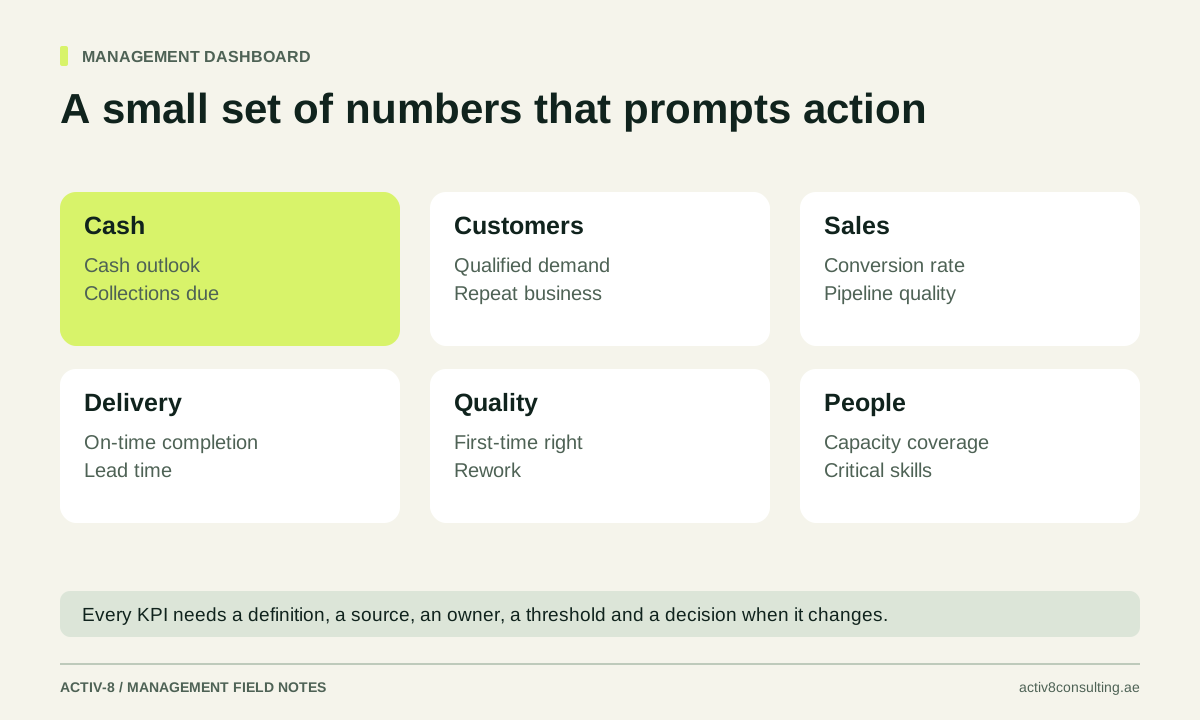
For a service business, a first dashboard might cover qualified demand, conversion, contribution, delivery reliability, customer outcomes and cash collection. The exact measures depend on the business model and current priorities. Do not copy another company's dashboard without checking whether its definitions and decisions match yours.
Combine outcome measures with indicators that reveal emerging pressure. Completed sales are an outcome; a growing queue of overdue proposals may signal a future problem. On-time delivery is an outcome; work scheduled beyond available capacity may provide earlier warning. A leading indicator is useful only when there is a credible relationship to the outcome and an action available.
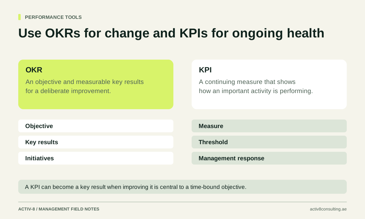
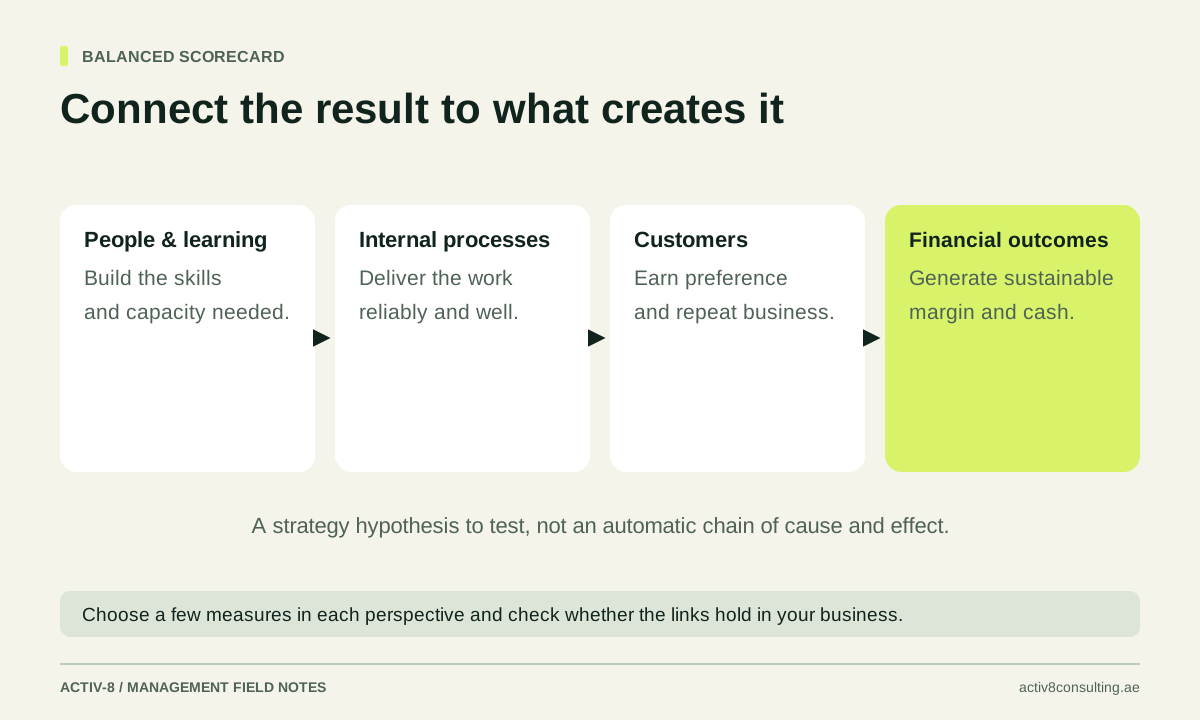
Avoid balancing the dashboard by adding arbitrary numbers from every department. The measures should describe how the business creates value and where the current constraints sit. The balanced scorecard guide provides a broader strategy-linked view, while the OKR comparison explains how ongoing health measures differ from time-bound improvement objectives.
Write a definition before building the chart
Each KPI needs a name, purpose, calculation, source, owner, update frequency and treatment of exceptions. Define the numerator and denominator for rates. State whether cancelled work, internal jobs, duplicates or incomplete records are included. A shared label such as “conversion rate” can conceal several different calculations.
For example, proposal conversion might mean accepted proposals divided by all proposals sent in the same month, or accepted proposals from a defined cohort divided by that cohort's total. These approaches answer different questions because some proposals remain open at month-end. Choose the method that fits the decision and explain it clearly.
Use the downloadable metric-definition worksheet to record these choices. Test a sample against the underlying records before automating the report. If the source is unreliable, display the limitation and assign a fix. Missing data should appear as unavailable or incomplete, not silently become zero. A dashboard becomes trustworthy through consistent definitions and reconciliation, not through visual polish alone.
Set targets, tolerances and comparison periods carefully
A target is the outcome the business wants; a forecast is the outcome currently expected. Keep them separate. Showing both can reveal a gap that needs action. Replacing the forecast with the target removes that information and makes the dashboard less useful for planning.
Choose comparisons that account for seasonality, work mix and meaningful business changes. A month-to-month decline may reflect fewer working days or the completion of a large one-off project. Include a short explanation rather than relying on colour alone. Where volume is low, a single case can change a percentage sharply, so show the denominator alongside the rate.
Use thresholds as prompts for review, not automatic verdicts. A red measure should lead to a defined question or response. If every small movement triggers an alarm, managers may stop paying attention. If a threshold has no evidence behind it, label it as a provisional management choice and review whether it identifies issues early enough to be useful.
Design the page around attention and action
Put the most decision-relevant information first. A simple layout can show the current value, comparison, trend, status and owner for each KPI. Use consistent time periods and units. Make it clear whether a number is currency, hours, jobs or a percentage. Avoid making the reader infer the meaning from a chart title alone.
Show enough history to distinguish a trend from noise, but keep the main view readable. Use detail pages or supporting tables for investigation. Decorative gauges and multiple colours can make a dashboard harder to understand when a plain trend line and a short explanation would communicate the issue more directly.
Include a small action area for the decisions arising from the review. For an overdue-job measure, record the reason, owner and next action rather than merely displaying a red box for another week. The management meeting guide explains how to use the dashboard in a decision-focused conversation. The dashboard and meeting should reinforce each other rather than duplicate reporting effort.
Work through an illustrative service dashboard
Imagine a small technical-services company. Its dashboard shows qualified enquiries, proposal conversion, contribution per completed job, first-time completion, overdue jobs and overdue customer balances. The sales owner updates demand and proposals, operations owns delivery measures and finance owns contribution and collection. These are illustrative choices, not universal benchmarks.
In one review, enquiries are stable but overdue proposals and quote turnaround increase. Delivery capacity is also under pressure. The team investigates whether technical staff are spending more time on live jobs and less on proposal support. The useful response may be a scheduling or approval change, rather than immediately increasing marketing spend.
In another review, sales rise while contribution per job falls. The team checks discounting, service mix, subcontractor cost and rework. The dashboard has identified a question; it has not diagnosed the cause automatically. This distinction matters. A number can direct attention to a problem, but the decision still requires context, investigation and the judgement of the people responsible.
Launch a small version and improve the definitions
Use a short data-quality note for each measure during the first few reporting cycles. Record missing records, manual adjustments and reconciliation differences. Assign a person to resolve recurring problems and retain the note when interpreting the trend. This is more useful than delaying every decision until the data is perfect or hiding the limitations entirely.
Start with a manageable dashboard and run it through several real review cycles. Observe which measures lead to useful discussion, which cause repeated confusion and which require disproportionate manual effort. Improve definitions and sources before adding more indicators. A dependable small dashboard is more valuable than an impressive page that managers do not trust.
Assign ownership for maintenance. Business definitions change when services, systems or processes change, so keep a short change log. Explain when comparisons are no longer directly like-for-like. Review access and distribution so people receive the information needed for their role without unnecessary exposure of sensitive customer or staff details.
Use the worksheet below to define your first measures. If you need help connecting systems, reconciling data and building a practical management view, explore Activ-8 reporting and business intelligence. Bring the decisions you need to make and the reports you currently use. The goal is a dashboard that helps the team act earlier and with better evidence, while remaining simple enough to maintain after the initial project ends.
As a final test, remove one proposed KPI and ask which decision would become worse. If the answer is unclear, leave it off the first version. This creates room for the measures that the team can define, trust and use consistently, and gives later additions a clear standard to meet.
PUT IT INTO PRACTICE
KPI definition worksheet
Treat the definitions as illustrative starting points. Choose only the measures that inform a decision, confirm their population and time period, and name the source and owner. Enter your own thresholds and actions after reviewing a baseline. No targets or results have been prefilled.
Download the worksheetCSV file · Opens in Excel or Google Sheets · No sign-up required
Sources & further reading
Primary guidance behind the methods discussed. The examples, diagrams and tools in this article are original Activ-8 material.
Put the thinking into practice.
Explore reporting and business intelligence Discuss your business with Mark